On the borderless map of a magical planet, little beings pick, brush, weave, fish, and collect elements from their natural environment to sustain their life as a group.
This essential balance turns into chaos once they misuse their findings to polish their individual appearance. ‘The song navigates between the possible meanings of the word: careful as in “full of care”, as in “meticulous”, careful as in “being cautious”, “discreet”, or careful as a warning for imminent danger. I took the simultaneousness of these concepts as a conflict: that of wanting to be safe, aware, accepted while craving to stand out and be noticed, regardless of what surrounds you. Hinting at the ambivalence of the mantra « Careful », the animation acts as two sides of the same coin: the fascination for uniqueness and diversity becomes overshadowed by self-obsession and vanity.

The repetition creates a distortion between what you hear and you think you hear. Reflecting on the music, I wanted to install an ambiguity between what you see and what you think you see. In a non-linear approach, the animation plays with coexisting loops and rich detail. The accumulation of small events blends in together in an abstract magnetic set-up, allowing the perception to be different each time. I developed a universe teeming with cycles and magical elements: fruit oil, lave pearls, strawberry skeletons, egg cages, flower pipes…

All these become accessories for humans to explore their own singularity. Yet, by doing so, the collectivity is disrupted. Self-admiration takes over, closing the protagonists inside their own bubble, as the landscape is torn apart. The camera is no longer a window into the macrocosm but a mirror for the characters. In order to visually materialize this shift, I chose to combine two visual spaces: one of the timeless, physical geographical maps and scientific illustrations together with the contemporary, virtual space of social media and profile pictures.’
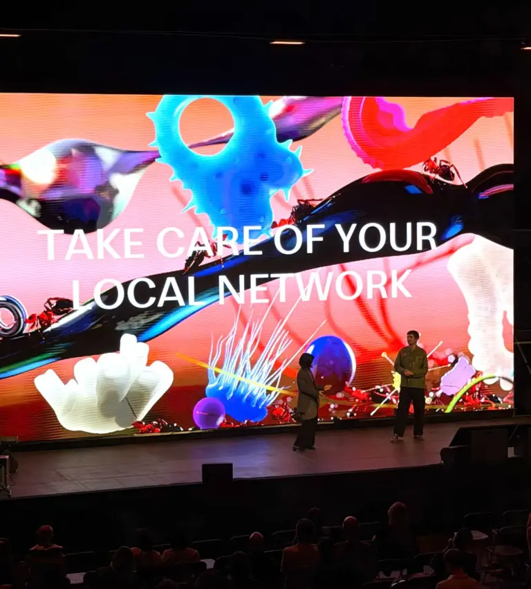
Careful is part of a larger visual campaign designed for the release of Jo Goes Hunting’s second album « Front Row ». The graphic universe that unfolds in the animation was also turned into a pattern and printed on fabric, as a 3x8m stage backdrop surrounding the musicians on stage. Alice Saey also designed the album artwork and single covers.