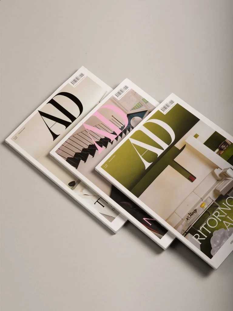
Giga redesigns AD Italia with a new visual identity inspired by Italian design history
Milan-based design studio Giga has developed a new visual identity for AD Italia, the Italian edition of Architectural Digest, to mark the magazine’s 45th anniversary. Introduced with the November 2026 issue, the AD Italia redesign draws on the history of Italian design to establish a distinct editorial language. Led by the studio in collaboration with head of editorial content Asad Syrkett, the project examines what makes design recognisably Italian and how those characteristics can inform a contemporary publication.
The redesign began with a question that extended beyond the magazine’s appearance. How could AD Italia communicate its cultural identity without relying on familiar symbols or nostalgic references? Giga approached the challenge by identifying four principles from different periods of Italian design history: classical proportions, essential functionalism, intellectual wit and colours inspired by the everyday landscape. These ideas became practical guidelines for an editorial system intended to distinguish the Italian edition from its international counterparts while maintaining the clarity expected of an established architecture and design publication.
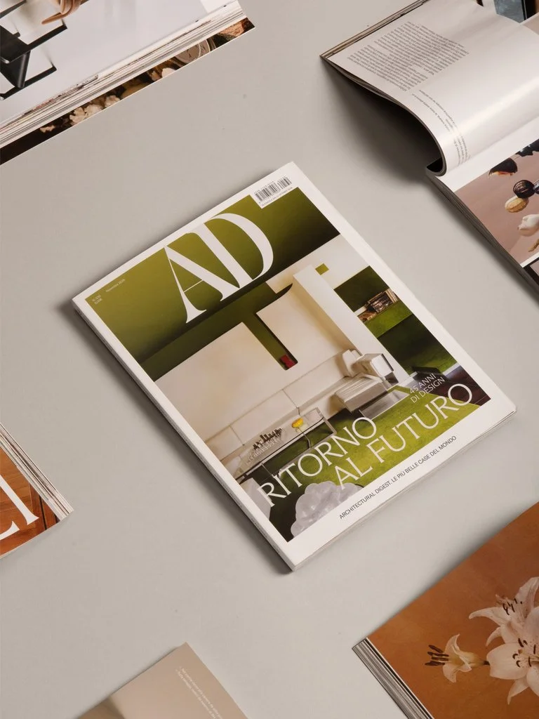
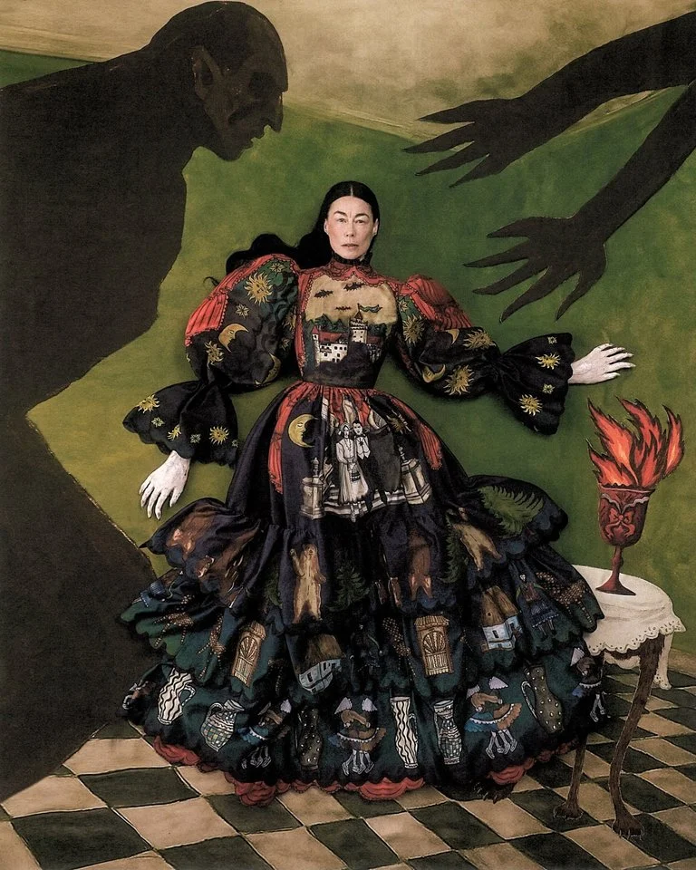
Each principle informs a different aspect of the magazine’s graphic design. Classical architecture provides a foundation for proportion and composition, while the functional thinking of Achille Castiglioni, Gio Ponti, Bruno Munari and Massimo Vignelli influences the organisation of information. The experimental attitude of Radical Design introduces humour and unexpected visual relationships, referencing figures such as Ettore Sottsass and Gaetano Pesce alongside Gufram and Olivetti’s advertising. The colour palette takes inspiration from Luigi Ghirri’s photography, particularly his observations of the Italian landscape and its understated everyday tones.
Typography plays an important role in bringing these references together. The new editorial identity uses Arizona by Dinamo Typefaces, a type family whose refined letterforms evoke classical engraved lettering. A structured grid establishes consistency across the magazine, while changes in scale, imagery and titles create variation between articles and sections. The layouts favour clear hierarchies and carefully controlled spacing, allowing readers to distinguish editorial content from advertising. The same principles extend to the cover design, section openings and recurring formats, creating a coherent visual system without imposing identical compositions throughout the publication.
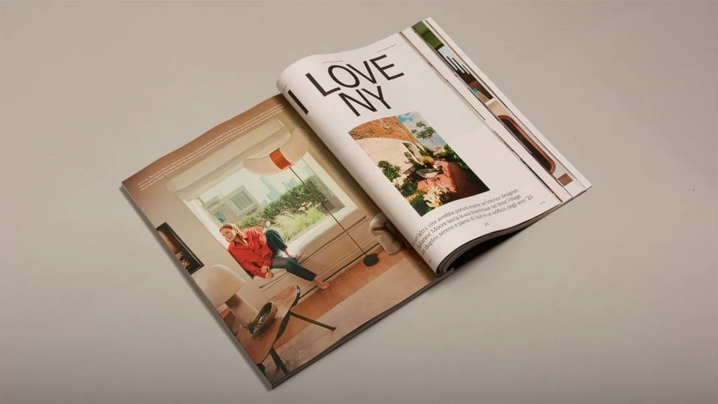
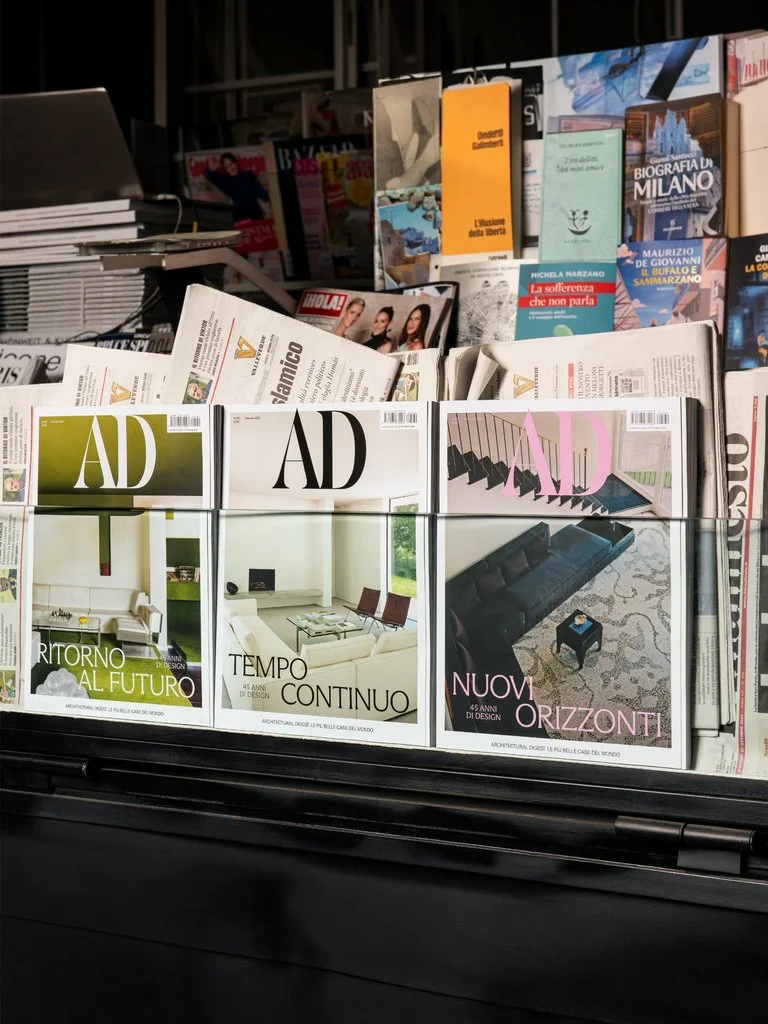
Beyond its printed format, the AD Italia redesign considers how an established magazine can communicate with different generations of readers. Giga drew inspiration from art and architecture publishing to develop an identity that appeals to younger audiences in their thirties and forties while remaining familiar to longtime subscribers. The system also accommodates digital platforms and social media, allowing the publication to maintain a consistent visual language across multiple formats. Established in Milan in 2017 by Giacomo Scandolara, Gabriele Donini and Pablo Galbusera, Giga brings experience in branding, editorial design and digital communication to the project.
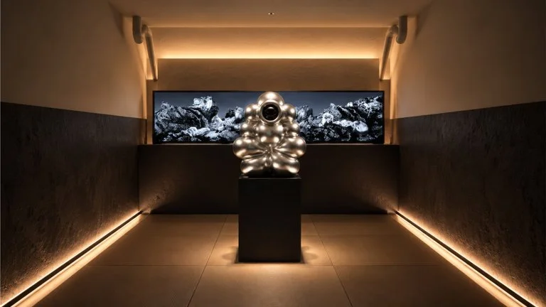
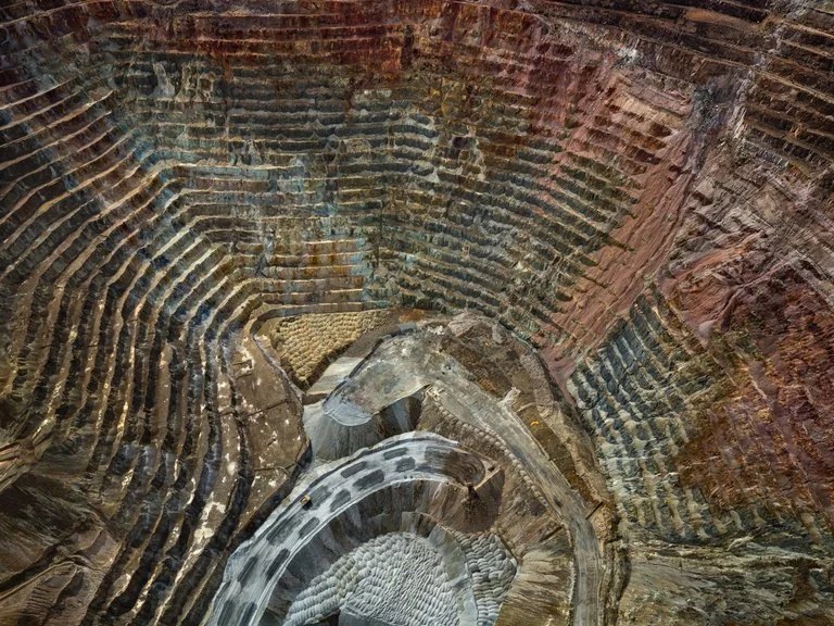
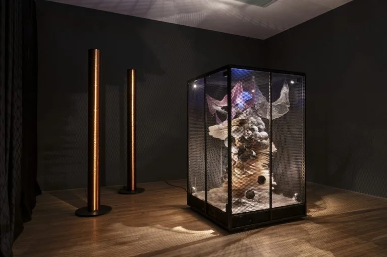
The new identity was presented through a large-scale installation at PAC Milano, curated by architect Luca Cipelletti. Occupying several rooms of the contemporary art institution, the presentation included a final space designed by Giga and dedicated to the magazine’s present and future. Four phrases summarised the project’s guiding ideas, accompanied by reference images from Italian design and photography. For creative director Gabriele Donini, the intention was to use historical references as criteria for individual design decisions, giving AD Italia an editorial identity informed by its cultural heritage and capable of developing beyond its anniversary issue.
All images courtesy of Giga, shared with permission