Yating Liu’s Dynamic Typography Masterpiece, ‘The Algae’ Typeface
Yating Liu, a visionary artist in the realm of typography, draws her creative energy from the rich tapestry of nature’s vibrant scenes. Her work is an exquisite fusion of inspiration drawn from the bold and contrasting style of Didot fonts and the captivating allure of marine life.
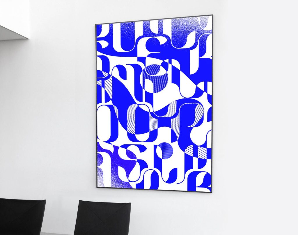
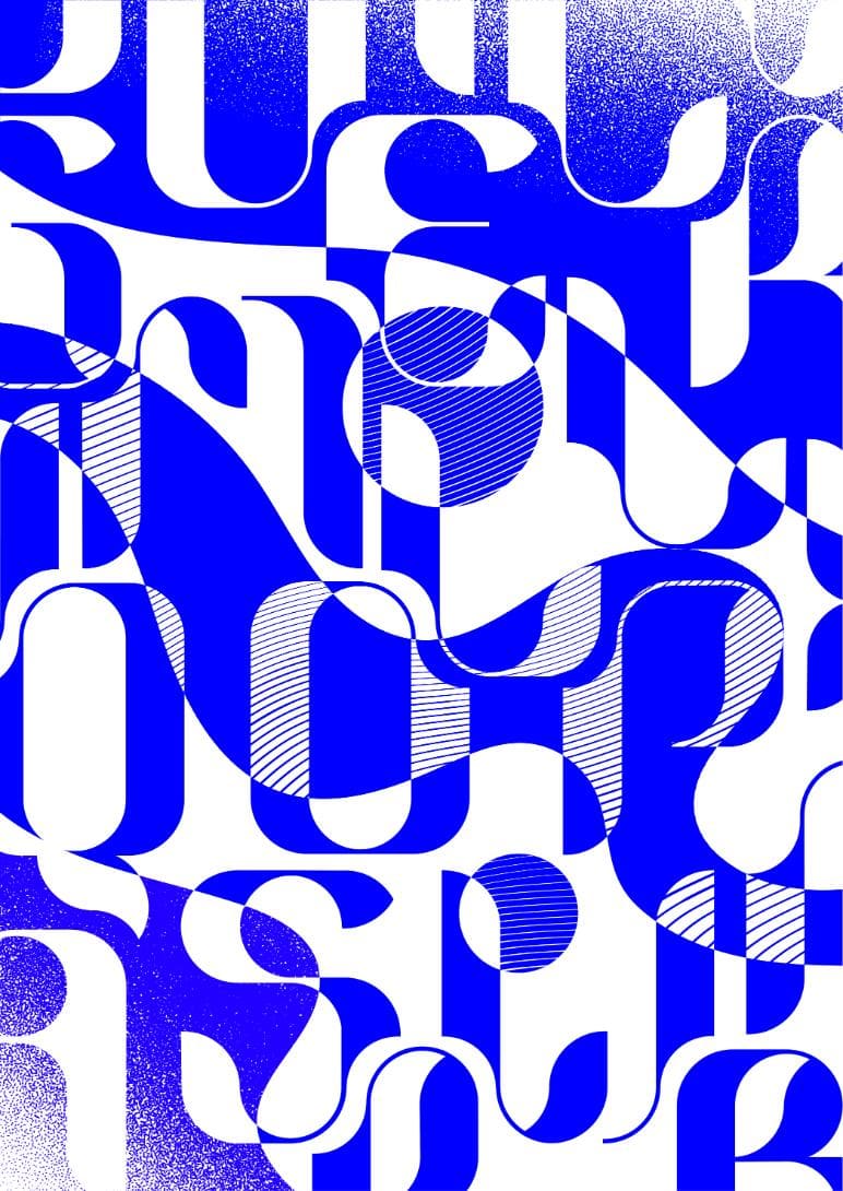
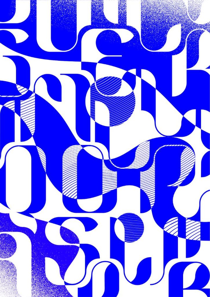
In the realm of typography, Liu’s noteworthy creation is “The Algae” typeface, a masterpiece that reflects her deep connection with the ocean’s intricacies. The bold strokes and contrasting elements of Didot fonts have left an indelible mark on her artistic expression, guiding her towards the creation of a typeface that captures the essence of marine life in all its delicate beauty.
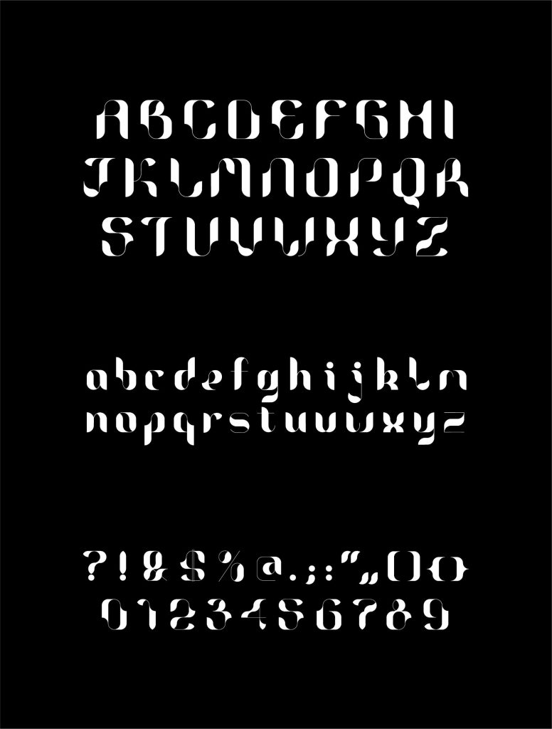
“The Algae” typeface is a testament to Liu’s dedication to conveying the subtle nuances of the underwater world. With a design that mimics the fluidity of seaweed drifting in the deep sea, each letter seamlessly connects to the next, creating a captivating rhythm that sparks the imagination. The font, meticulously crafted based on a complex grid system, elegantly breaks free from traditional constraints, allowing for a dynamic and irregular style that mirrors the organic forms of seaweed in motion.
What sets Liu’s work apart is the thoughtful consideration given to the viewer’s experience. The typeface offers a unique perception from both a distance and up close, inviting observers to explore the intricate details that give each letter its own life. The twists and turns in the font mimic the elegant dance of seaweed, resulting in a design that is both organic and dynamic.