In conversation with Peilin Li designing at the tempo of a Guzheng
Peilin Li is an illustrator and motion designer whose creative process draws deeply from the rhythm and sensitivity of playing the Guzheng. The instrument’s blend of precision and fluidity mirrors how she builds visuals—layered, detailed, and rich with motion. Like music, her compositions unfold through pacing, contrast, and narrative rhythm, inviting viewers to explore rather than simply observe.
Rooted between Chinese and American cultural contexts, Peilin Li’s work blends maximalist storytelling with graphic structure. Bold colors, intricate characters, and dynamic scenes carry a sense of life, movement, and humor, whether in still images or motion pieces. Her cross-disciplinary approach has led her to collaborate with global brands while maintaining a distinct artistic voice shaped by curiosity, cultural hybridity, and a love for visual rhythm.
You often compare your creative process to playing the Guzheng. How does this musical influence guide the rhythm, pacing, or structure of your illustration and motion work?
I often compare my creative process to playing the Guzheng, because its sound isn’t linear, it’s built through rhythm, intensity, and layering. My visual compositions follow the same logic.I organize my visuals through contrast. Bold colors, characters, and key details work like high notes that grab attention, while backgrounds and textures unfold more slowly. In motion design, I use speed and transitions to capture the feeling of how music moves and transforms. Ultimately, I want my work to feel like a piece of music in progress, layered, rhythmic, and full of energy, something that stays with you instead of ending at first glance.
When a project combines motion, illustration, and graphic design, how do you decide which element leads and which supports—much like an orchestra finding its balance?
For me, projects that combine motion, illustration, and graphic design usually feel more like branding projects. In those cases, I let graphic design take the lead. At the beginning, I focus on building a clear and stable visual system, like the logo, layout, color palette, and overall visual language.
These elements are basically the backbone of the whole project. Once that system is in place, I start expanding from there. Illustration comes in to add more emotion, storytelling, and personality, and motion helps tie everything together, using movement and rhythm to make the brand feel more alive and engaging.
3. Many of your illustrations feel both intricate and fluid. What visual principles or personal philosophies shape this signature style?
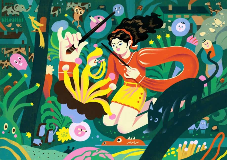
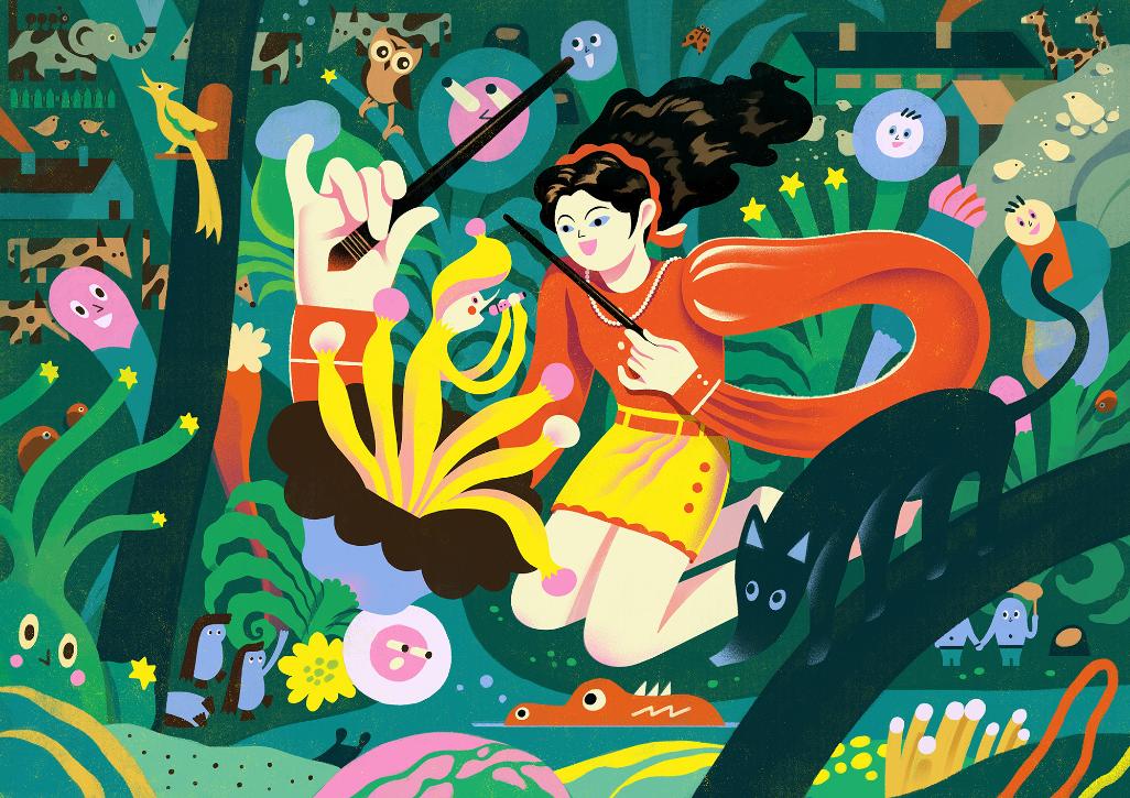
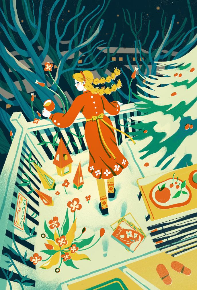
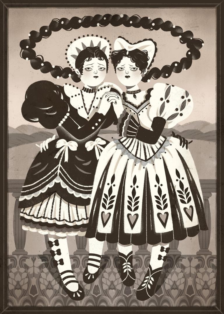
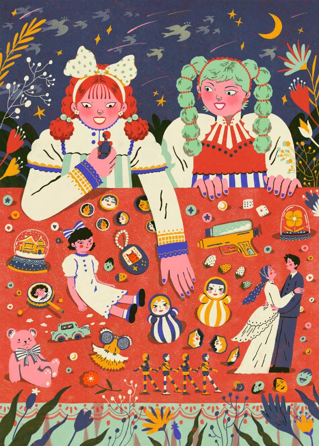
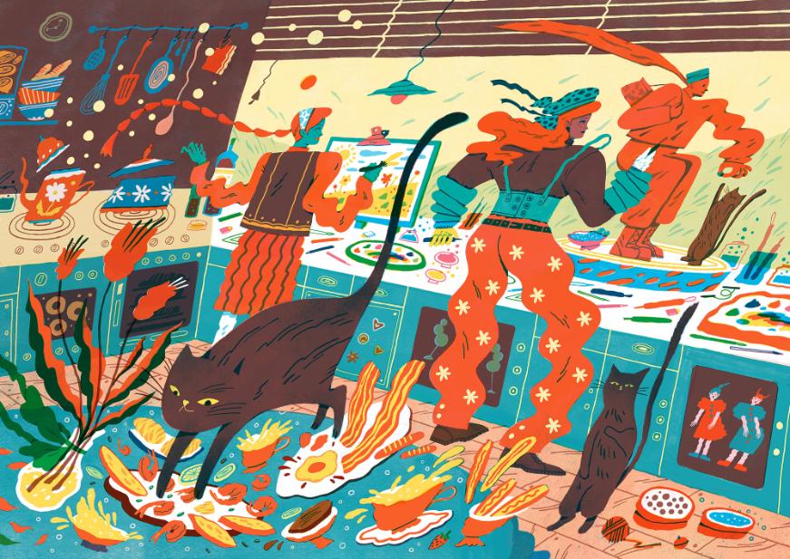
I’ve always had a very natural attraction to maximalism. I love spending a long time with a complex image, going back to it again and again, noticing small hidden details, and letting my imagination slowly piece together the story it’s trying to tell. For me, that feeling of being “invited to explore” is what makes an image truly fascinating.
That’s why, in my own work, I intentionally include a lot of narrative driven details. I want viewers to keep discovering new information and new possible interpretations, just like I do. At the same time, I don’t want my work to feel like it’s just stacking complexity for the sake of it, so structure is just as important to me. I enjoy carefully thinking through hierarchy, placing focal points and details in a way that keeps the composition rich but still easy to read.
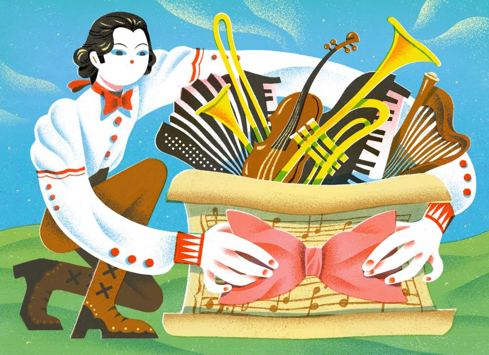
I also really care about the sense of life in an image. I’ve found that drawing figures or objects in motion naturally brings in rhythm and energy. Even in a still illustration, capturing a moment that feels like it’s “happening” can make the image feel alive and fluid, rather than frozen.
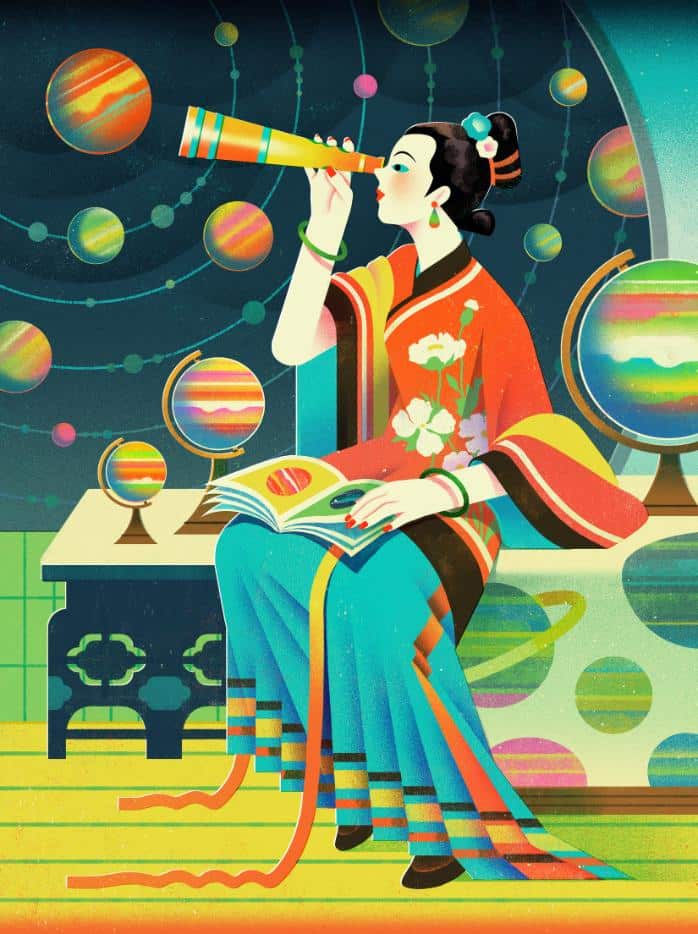
You’ve exhibited internationally and worked with global brands. How does your cultural background shape the stories, colors, or symbols you choose to use?
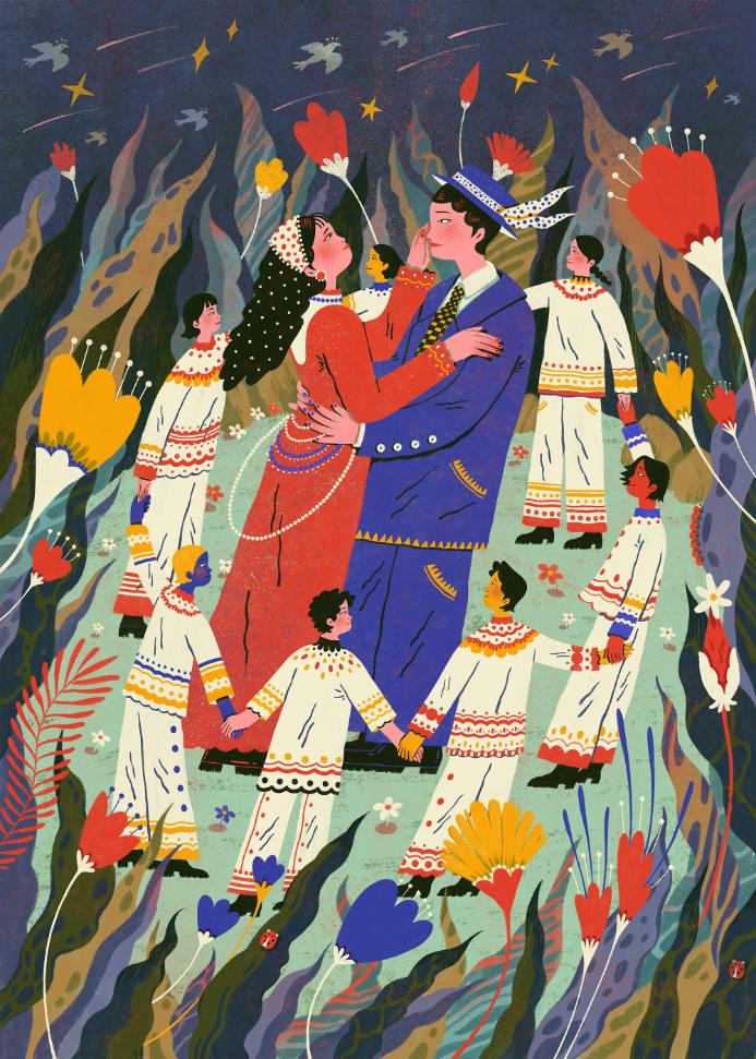
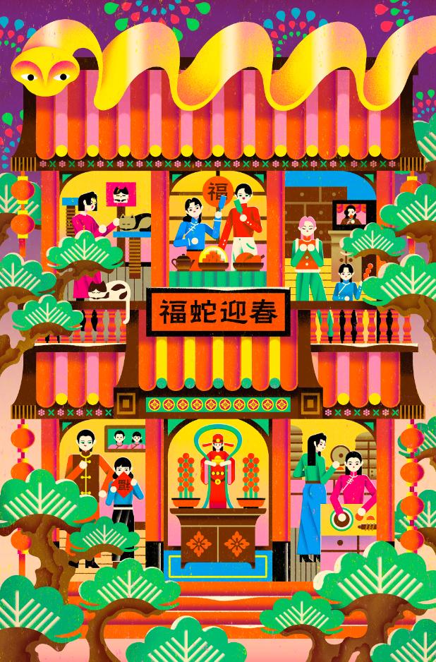
I think my Chinese cultural background allows me to naturally capture the atmosphere of Chinese holidays, along with the memories and emotions connected to them. At the same time, living and studying in the U.S. has helped me understand how different cultures are reinterpreted, adapted, and continue to evolve when they travel across borders. This cross-cultural perspective has had a deep influence on my creative work.
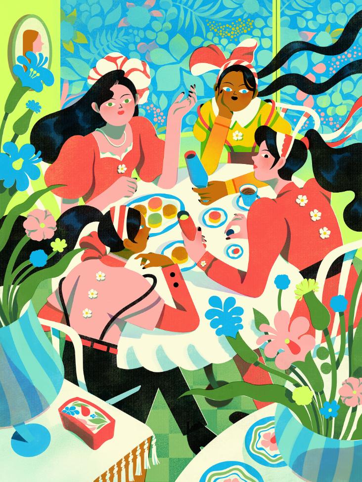
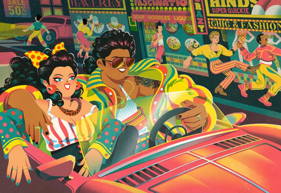
Because I’ve lived in both Chinese and American cultural contexts, my work often exists in a kind of in-between space. I like drawing from the concept of scattered perspective in traditional Chinese painting to build my compositions, using it to capture collective, everyday scenes that can hold multiple moments and viewpoints at once. At the same time, I’m heavily influenced by American street and graffiti culture, so I tend to use bold colors, dynamic compositions, and exaggerated character forms.
This combination allows me to shift between different cultural languages. Some of my work feels more “American” to Chinese audiences, while to American viewers, it often reads as distinctly Eastern. I really enjoy this in-between position, because it lets me use visual language as a way to build cross-cultural communication.
Could you describe a project that challenged your artistic approach and forced you to rethink your process or assumptions?
One of the most challenging projects for me was the Hong Kong rebranding project. At first, I wanted to use visual language to express Hong Kong as a place where tradition and modernity coexist. I chose more traditional Chinese serif typefaces and paired them with classic English serifs, hoping the typography could carry a sense of history and cultural depth.
However, once I applied them to posters and social media templates, I realized the overall look felt too “old” and didn’t reflect Hong Kong as a highly modern city. This gap between intention and outcome forced me to rethink my initial assumptions.
Eventually, I adjusted the direction of both Chinese and English typefaces and combined them with a slightly retro but more playful illustration style. This balance felt closer to Hong Kong’s real, complex cultural identity. Even now, I still feel a sense of “unfinishedness” about my original Chinese type choice, which is why I’m planning to design a custom Chinese typeface for this project.
This experience taught me that design doesn’t have to follow a perfectly linear path. Being open to revising early decisions can sometimes make the work feel more real and more alive.
Your portfolio spans client-driven work and personal explorations. How do you maintain your own artistic voice when working within the constraints of big brands like Disney or Farfetch?
By consistently sharing my work on different social media platforms and with the support of my illustration agency in China, my work has been seen by more brands. Most of the time, brands reach out to me because they already resonate with my existing visual style and feel it fits their needs, so I rarely face strong limitations around having to suppress my personal voice.
That said, I’m always open to trying new ways of visual expression, and I enjoy expanding into different styles. These experiments don’t weaken my work. Instead, they often bring new inspiration when I return to my personal projects.
When working within a brand framework, I focus on what stays consistent across styles. For me, that’s a strong sense of movement and a high level of detail. Whether it’s in composition, character poses, or visual layering, I consciously keep these qualities, and they’ve become the core of my recognizable voice.
What themes or emotions do you hope viewers consistently take away from your work—whether from a still illustration or a motion piece?
I hope that when people see my work, they feel a sense of connection, like, “I’ve experienced this too.” I also want my artworks to feel light and a little humorous, rather than something that needs to be taken too seriously.
Most of my inspiration comes from small, real moments in everyday life, things that often get overlooked, subtle emotions, or tiny pieces of beauty in ordinary days. I like turning these moments into visuals, so they can be seen again in a softer and more gentle way.
So if, at some point, a viewer feels understood, or simply smiles and relaxes for a second, that already means a lot to me. It tells me that the work has made a real connection, not just a visual impression.
Looking ahead, what new directions, techniques, or creative territories are you excited to explore in your future practice?
Looking ahead, I hope to work on more projects that blend graphic design and illustration, continuing to explore the space between the two. I’m also excited about creating my own children’s picture book using my existing visual language, where storytelling, imagery, and rhythm can come together in a long-term project.
Recently, I’ve been experimenting with different digital mediums and combining them within a single image, while applying graphic design thinking to make each element feel intentional rather than purely decorative. In the future, I hope my work can become more layered and structured, while still keeping its sense of movement and detail, creating richer visual textures and more immersive narratives.
All images courtesy of Peilin Li
Peilin Li website: https://peilinli.design/
Interested in publishing your work?
If you are interested in having your work featured on Visual Atelier 8, please visit our Submission page. Once approved, your work will be presented to our global audience of professionals and enthusiasts.


al builds work chair from polyurethane tube system")

