
X Games rebrand by Gwen Geng redefines action sports visual identity
Gwen Geng presents the X Games rebrand as a graphic design project that reimagines the visual identity of the globally recognized action sports event founded by ESPN. Based in Los Angeles, the multidisciplinary designer develops the X Games rebrand as a dynamic visual system that reflects contemporary digital culture while responding to the evolving language of skateboarding, BMX, motocross, and snowboarding. The project positions the X Games rebrand as a flexible identity framework designed for broadcast, digital platforms, and live event environments.

The X Games rebrand builds on Gwen Geng’s background in mathematics and graphic design, where logic and abstraction inform visual outcomes. Her professional experience includes collaborations with Pentagram, Massive Assembly, and Amazon, as well as projects for Riot Games and EA Sports. This foundation supports a design methodology that translates abstract relationships into structured systems across typography, motion, interaction, and spatial applications. In the X Games rebrand, these principles guide the creation of a cohesive identity capable of adapting to multiple formats and scales.
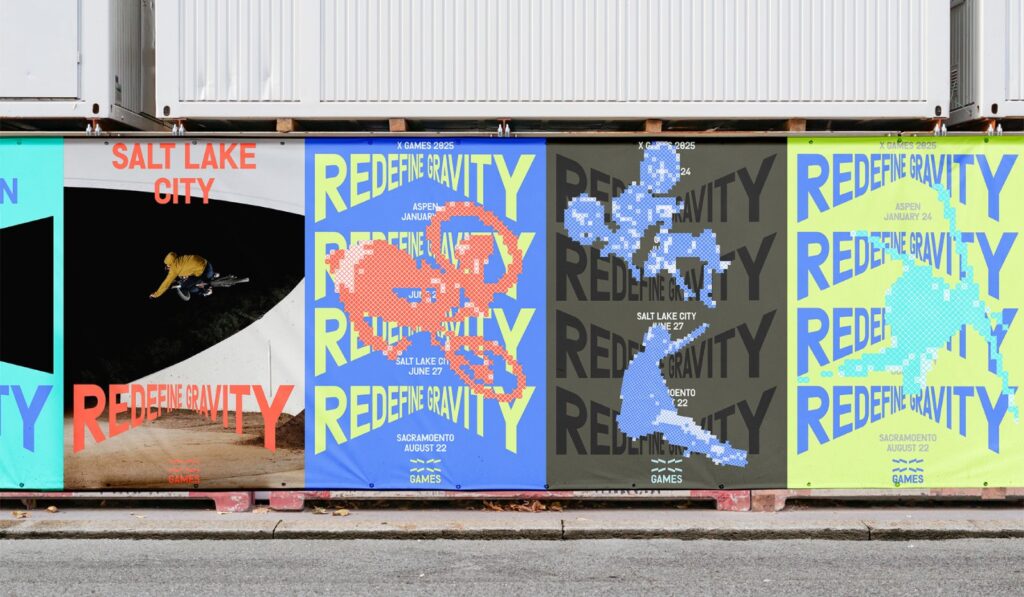
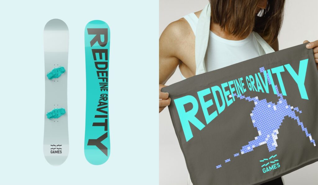
At the core of the X Games rebrand is the letter “X,” which functions as both symbol and structural device. Gwen Geng develops the X into a generative framework that communicates motion, uncertainty, and progression. Its geometry informs a modular system that extends into patterns, grids, and framing devices, allowing the identity to shift across different media while maintaining visual consistency. This approach transforms the X Games rebrand into a system that supports continuous variation, aligning with the nature of action sports where performance evolves through repetition and experimentation.
Typography plays a central role in defining the visual language of the X Games rebrand. Letterforms are manipulated through perspective and distortion derived from the geometry of the X, creating a sense of acceleration and spatial depth. This typographic system captures fleeting moments of movement that are often difficult to perceive in real time, translating them into legible visual compositions. The result is a graphic identity that mirrors the intensity and rhythm of action sports while remaining functional across editorial layouts, broadcast graphics, and digital interfaces.
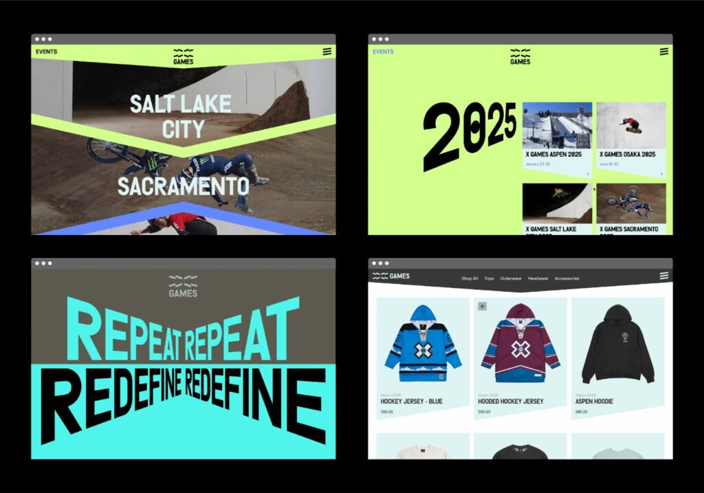
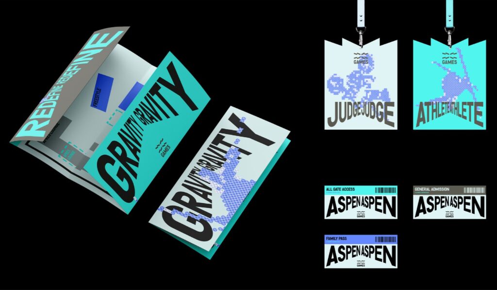
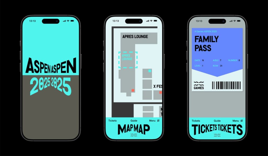
The X Games rebrand extends across a wide range of applications, including social media content, streaming platforms, event environments, and physical installations. Gwen Geng designs the system to operate seamlessly between screen-based experiences and on-site activations, ensuring continuity across audience touchpoints. From merchandise and environmental graphics to interactive digital outputs, the X Games rebrand amplifies the cultural and visual energy associated with the event. Through this project, Gwen Geng establishes a scalable identity that connects athletes, audiences, and media through a unified and adaptable design language.

All images courtesy of Gwen Geng, shared with permission
Interested in publishing your work?
If you are interested in having your work featured on Visual Atelier 8, please visit our Submission page. Once approved, your work will be presented to our global audience of professionals and enthusiasts.


